A beach scene painted on the Galaxy Note using Paintology and the ‘mist’ brush tool
24 Sep 2012|
2925
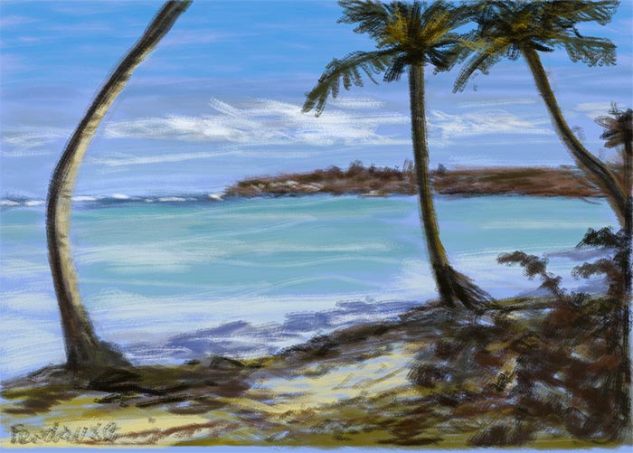
 Fig-1[/caption]
Whenever you embark on any painting or drawing, its always a good idea to have an idea of the tools that you will use ahead of time. If you stick to say one brush for the entire painting, it will constrain you to use that brush in more ways than one. The result is that you have a better understanding of the capabilities of that tool and will extend your knowledge base to produce further interesting effects to your paintings. I have deliberately drawn this Paintology example (fig. 1) using only the ‘mist’ brush tool just to see what the total overall effects could be achieved with this brush alone.
[caption id="attachment_2226" align="alignright" width="300"]
Fig-1[/caption]
Whenever you embark on any painting or drawing, its always a good idea to have an idea of the tools that you will use ahead of time. If you stick to say one brush for the entire painting, it will constrain you to use that brush in more ways than one. The result is that you have a better understanding of the capabilities of that tool and will extend your knowledge base to produce further interesting effects to your paintings. I have deliberately drawn this Paintology example (fig. 1) using only the ‘mist’ brush tool just to see what the total overall effects could be achieved with this brush alone.
[caption id="attachment_2226" align="alignright" width="300"] Fig-2[/caption]
[caption id="attachment_2227" align="alignright" width="300"]
Fig-2[/caption]
[caption id="attachment_2227" align="alignright" width="300"] Fig-3[/caption]
[caption id="attachment_2228" align="alignright" width="300"]
Fig-3[/caption]
[caption id="attachment_2228" align="alignright" width="300"] Fig-4[/caption]
We start off using a blue shade for the background and etch the main parts of the painting as shown in fig. 2. Don’t worry too much about the exact placement, the main thing is to keep the horizontal line the middle roughly linear. I found that when I was filling the sky as shown in fig. 3, I was trying to avoid the trees that I had drawn earlier. In hindsight, I would have probably filled the sky information along with the sea and foreground and then etch out the trees and other components of the scene. I used the ‘shade’ tool for the outline to etch the trees and land mass. By varying the degree of hardness, size and density you can control the translucency of the color applied to the canvas. Use horizontal strokes as shown in the drawing. For the sea, I switched to a turquoise color.
[caption id="attachment_2229" align="alignright" width="300"]
Fig-4[/caption]
We start off using a blue shade for the background and etch the main parts of the painting as shown in fig. 2. Don’t worry too much about the exact placement, the main thing is to keep the horizontal line the middle roughly linear. I found that when I was filling the sky as shown in fig. 3, I was trying to avoid the trees that I had drawn earlier. In hindsight, I would have probably filled the sky information along with the sea and foreground and then etch out the trees and other components of the scene. I used the ‘shade’ tool for the outline to etch the trees and land mass. By varying the degree of hardness, size and density you can control the translucency of the color applied to the canvas. Use horizontal strokes as shown in the drawing. For the sea, I switched to a turquoise color.
[caption id="attachment_2229" align="alignright" width="300"] Fig-5[/caption]
[caption id="attachment_2230" align="alignright" width="300"]
Fig-5[/caption]
[caption id="attachment_2230" align="alignright" width="300"] Fig-6[/caption]
[caption id="attachment_2231" align="alignright" width="300"]
Fig-6[/caption]
[caption id="attachment_2231" align="alignright" width="300"] Fig-7[/caption]
[caption id="attachment_2232" align="alignright" width="300"]
Fig-7[/caption]
[caption id="attachment_2232" align="alignright" width="300"] Fig-8[/caption]
In fig. 5, for the land mass, I use a brownish tinge which is located near the yellow/orange/red color band of the Paintology app. Use horizontal strokes and try and to create ‘pockets’ of areas that resemble soil, stones and other land mass. The area of land is further accentuated by switching to the different shades of the same color swatch (fig. 6). I finish this stage of the drawing by using a dark brown to outline the tree trunks. Fig. 7 shows further enhancements to the painting by adding some more details. The details include distant water ripples (white) next to the far distant land, additional dark tones to the land and also some smoothing of the clouds using a off-whitish color. It is a good idea to compare figs. 6 and 7 side by side to see the subtle differences. In addition, I also use a deeper color to outline the left edge of the tree trunks.
[caption id="attachment_2224" align="alignright" width="300"]
Fig-8[/caption]
In fig. 5, for the land mass, I use a brownish tinge which is located near the yellow/orange/red color band of the Paintology app. Use horizontal strokes and try and to create ‘pockets’ of areas that resemble soil, stones and other land mass. The area of land is further accentuated by switching to the different shades of the same color swatch (fig. 6). I finish this stage of the drawing by using a dark brown to outline the tree trunks. Fig. 7 shows further enhancements to the painting by adding some more details. The details include distant water ripples (white) next to the far distant land, additional dark tones to the land and also some smoothing of the clouds using a off-whitish color. It is a good idea to compare figs. 6 and 7 side by side to see the subtle differences. In addition, I also use a deeper color to outline the left edge of the tree trunks.
[caption id="attachment_2224" align="alignright" width="300"] Fig-9[/caption]
Fig. 9 shows further enhancements to the painting which include the light shades to the right of the tree trunks and the tree leaves. For the tree leaves, I use the predominant color of the tree leaves which is a slight yellowish brown but not exactly green. You should experiment with the colors to make sure that it matches the overall scene of the painting. I deliberately kept a neutral tone to the entire picture without giving any color emphasis to any specific part of the painting. Remember, you can do this very easily by making use of a color that is bolder in presence than the other colors on the canvas. This is often used to accentuate a sunset or areas of light and shade within a painting or even making flowers or other specific items to stand out. The final part of the painting is to do the area of dark/hazy blue near the sandy beach shore and we end up with our final painting shown in fig. 1
This was a good class on using one brush tool only to do an entire painting. The ‘mist’ brush tool leaves a slightly ragged edges to the brush strokes and with some clever use of the hardness, size and density of the brush tool, it clearly shows the versatility of this tool. You can go ahead and use the other brush tools and do a similar painting to see the effects and the subtle differences achieved with each painting.
Happy painting!
Fig-9[/caption]
Fig. 9 shows further enhancements to the painting which include the light shades to the right of the tree trunks and the tree leaves. For the tree leaves, I use the predominant color of the tree leaves which is a slight yellowish brown but not exactly green. You should experiment with the colors to make sure that it matches the overall scene of the painting. I deliberately kept a neutral tone to the entire picture without giving any color emphasis to any specific part of the painting. Remember, you can do this very easily by making use of a color that is bolder in presence than the other colors on the canvas. This is often used to accentuate a sunset or areas of light and shade within a painting or even making flowers or other specific items to stand out. The final part of the painting is to do the area of dark/hazy blue near the sandy beach shore and we end up with our final painting shown in fig. 1
This was a good class on using one brush tool only to do an entire painting. The ‘mist’ brush tool leaves a slightly ragged edges to the brush strokes and with some clever use of the hardness, size and density of the brush tool, it clearly shows the versatility of this tool. You can go ahead and use the other brush tools and do a similar painting to see the effects and the subtle differences achieved with each painting.
Happy painting!